

In user interface (UI) design, every symbol is a story and every icon is a universe in miniature. Through icons, designers use visual storytelling to guide the user around the interface while sprinkling your brand’s ‘flavor’ throughout.
When done right, iconography combines simplicity with significance to produce a stellar user experience. But to use custom iconography well, you’ll need to master its principles and understand how to use it.
We’ve got you covered with this blog post, where we’ll look at iconography design principles, use cases, and ways to uplevel your iconography design skills.
Let’s jump in!
What are the basic principles of iconography design?
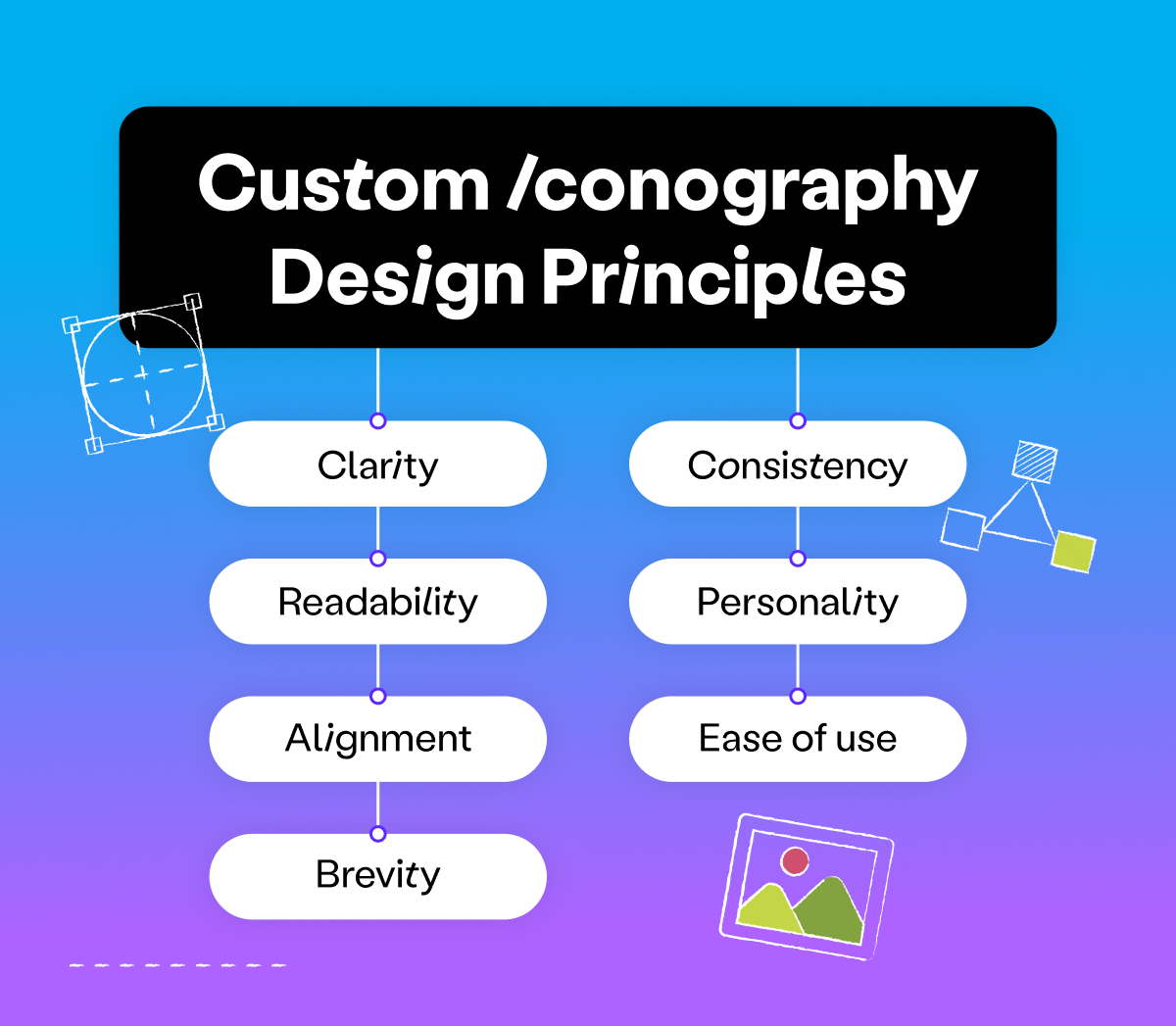
Let’s start with an exploration of the foundational principles of iconography design, where every stroke and shape is a building block in crafting intuitive and impactful visual narratives.
- Clarity: An icon should clearly communicate a concept without causing confusion or requiring too much time for users to understand its purpose.
- Readability: Icons should avoid overly fine or decorative lines and maintain enough space between the icon and any labels to ensure they are easy to read.
- Alignment: Proper adjustment is necessary to balance an icon within its frame and create a harmonious appearance.
- Brevity: The design should convey more with less, using fewer details and simpler concepts to communicate effectively.
- Consistency: All icons in a set should maintain the same style, including visual weight, stroke thickness, size, corner radius, shape, and fill to create a cohesive visual language.
- Personality: Icons should reflect the mood and personality of the product they represent, adding to the overall brand identity.
Ease of use: Beyond aesthetics, icons must be organized, well-documented, and easy for other designers and developers to use and implement.
What an icon system consists of
An icon system is a set of visual symbols used to enhance UI design by providing a common language that users can quickly recognize and understand.
When building an icon system, it’s essential to establish guidelines that ensure consistency across all icons. This includes decisions on size, stroke, fill, color, and grid usage.
- Size: Icons are typically designed at a standard size (like 24x24px or 32x32px) to maintain consistency, especially since many development teams use an 8-point grid system.
- Strokes and fills: The choice between stroked (outlined) and filled (solid) icons should be consistent within an icon set to avoid confusion.
- Color: Designing icons in a single color allows for flexibility in use across different parts of a product while maintaining consistency.
- Grids: Using a pixel grid helps in creating balanced and optically aligned icons.
- Organization: Once icons are created, they should be organized and documented clearly, making them easy to search and use within the design system.
An example of an icon system is Apple’s SF Symbols, a set of over 5,000 icons designed to match the aesthetics of iOS, macOS, watchOS, and tvOS so that UI designers can create interfaces that maintain a cohesive look across all Apple devices.
When do you need custom iconography?
When considering the integration of custom iconography into your design, it’s crucial to understand the specific scenarios and contexts where these unique visual elements can truly enhance user engagement and clarify functionality.
Below are some situations where a custom icon may be the right solution:
- App-specific functionality: This is when you need icons to represent app-specific functionality that standard icon sets cannot accommodate without creating ambiguity. For example, if your app has unique features like a recipe search or movie bookmarking that are not commonly represented by standard icons.
- Preventing user hesitation: If there’s a risk that users may hesitate or expend effort to understand an icon’s meaning, a custom icon may be more straightforward and reduce cognitive load.
- Ambiguity test: When an icon cannot convey its meaning without a title or description, it’s a sign that the icon is ambiguous and may benefit from customization to be more intuitive.
- Consistency in design: Custom icons should maintain a shared thematic style and consistent design elements with the standard icons to ensure the app feels cohesive and icons are easily recognizable as interactive elements.
- Equal visual weight: To avoid drawing the user’s attention disproportionately, custom icons should be designed to have equal visual weight, ensuring that all icons are equally engaging.
How Playbook uses custom iconography
Here at Playbook, we mostly use icons from Ant Design. However, we also developed our own library of custom icons, including an icon system specifically for licensing, as nothing in the default icon set quite matched our needs.
How a you can uplevel your iconography skillset
For aspiring designers eager to elevate their craft, let’s take a look at some practical strategies to sharpen and refine your custom iconography skills, turning basic designs into masterpieces of visual communication.
- Understand the fundamentals: Learn about iconography design principles such as clarity, readability, alignment, brevity, consistency, and personality. These principles help ensure that icons are effective in communicating their intended message and function within the user interface.
- Develop a systematic approach: Start by creating a consistent set of guidelines for icon design, which includes deciding on size, stroke, fill, and color. A systematic approach ensures harmony among icons used across different parts of a product.
- Use the right tools: Familiarize yourself with design tools like Adobe Illustrator, Figma, and Sketch. Choose the one that best fits your workflow and skill level — many designers recommend Figma for its precision and ease of use for UI elements.
- Practice with geometric shapes and Bézier curves: Use geometric shapes and Bézier curves to create icons. Mastering these techniques will add polish to your icons and help you create more complex designs.
- Learn from others: Analyze and learn from existing icons on platforms like Dribbble, Behance, and The Noun Project. Observing the work of others can provide inspiration and insight into effective icon design.
- Craft effective metaphors: Work on creating icons that are metaphors for the concept they represent. This requires creativity and an understanding of how to convey complex ideas through simple visual elements.
- Organize and document your work: Ensure that your icons are well-organized and documented, making them easy to use and integrate into design projects. Use clear naming conventions and organize icons by category. A great way to do this is by creating a dedicated Board in your Playbook workspace!
- Test icons in context: Before finalizing icons, test them within the context they will be used to ensure they function well within the intended user interface and are easily understood by users.
- Get formal training: Consider taking online courses to deepen your understanding of iconography and related UX/UI design principles.
Iconography in UI design: next steps in your professional journey
You’ve explored the principles and understood the components and skills necessary for successful iconography design that’s both functional and aesthetically pleasing.
But what’s next? How do you prepare for real-world challenges as a UI/UX designer?
Your next step is to arm yourself with knowledge beyond the pixels and vectors that will help you land your next (or first!) UI design job. That’s why we’ve put together this guide on UI/UX designer interview questions.
This article will guide you through the typical questions you might face in interviews, preparing you not just as a designer but as a professional ready to make a mark in the industry.
So, let’s keep the momentum going and jump into your next learning adventure!