
Typography is an essential component of effective communication and design. It’s not just about making words look good — it plays a crucial role in how users perceive and interact with content.
From influencing user engagement to affecting conversions, the choice of fonts and their arrangement can significantly impact the success of any design project.
Typography helps to establish a hierarchy of information, guiding readers through content and highlighting the most important elements. It’s also a core component of brand identity thanks to its ability to convey personality and set the tone for brand perception.
Getting typography right in your graphic design projects can wow your clients, boost brand image, and help increase sales. However, getting it wrong can have the opposite of the desired effect.
Some of the worst fonts include Comic Sans, which will ensure your designs look unprofessional, Arial, which comes across as boring and unimaginative, and Curlz, which can appear childish and gaudy.
Knowing what not to do in typographic design is just as important as knowing what works well — which is why we’ve rounded up seven examples of terrible typography you’ll want to avoid at all costs in your designs. Let’s dive into them.
1. Inappropriate font choice
Choosing the right font is crucial in any design project — whether it’s a website, an ad creative, a poster, or something else. Avoid overused fonts like Papyrus or Trajan — which has been dubbed the “movie font” for its regular appearances in movie posters — as they can make designs look unoriginal and unprofessional.
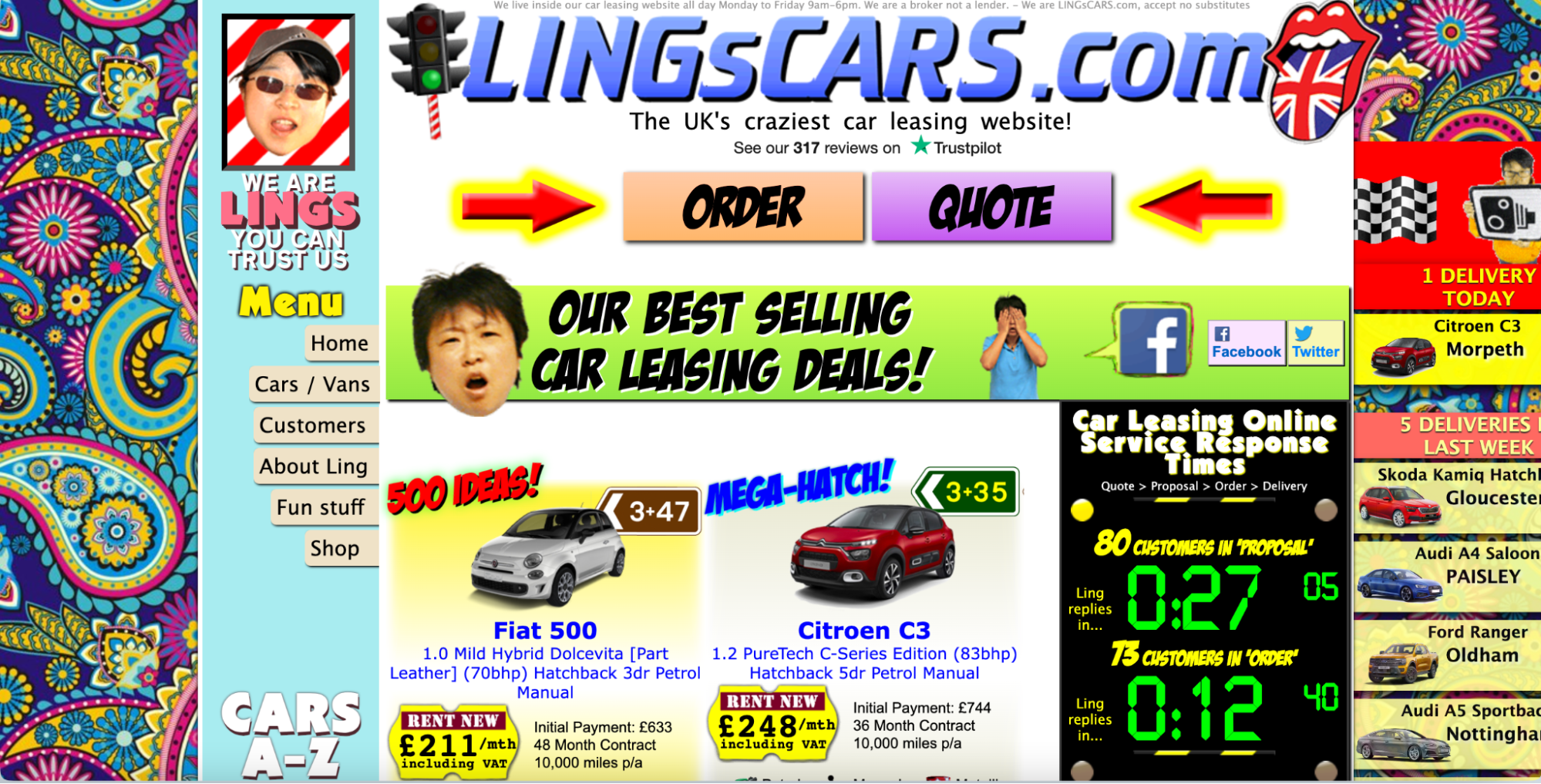
Lings Cars’ website is a bonanza of poor font choices (and design choices in general). With so much going on, it’s hard to know where to look, and the casual visitor would be forgiven for thinking it’s some kind of scam.
2. Too many fonts
You’ve heard that too many cooks spoil the broth — well, the same goes for fonts and your designs. While a variety of fonts can help reinforce your message in all the right ways, using too many can lead to a cluttered and unprofessional design that’s confusing to the viewer and fails to convey the right tone.
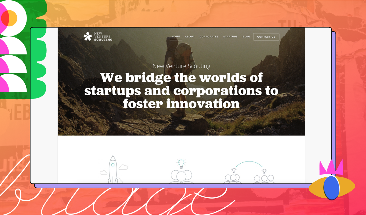
For example, take the New Venture Scouting website, which uses multiple font types, creating a disorganized appearance. Pop quiz: how many fonts can you identify on the site?
While some designers swear by the rule of two when it comes to fonts — one for titles and one for the text body — others prefer the rule of three, adding a third font for menus.
3. Inconsistent typography
Maintaining consistency in font sizes, styles, and formatting is essential for creating a cohesive and harmonious design. Inconsistencies can lead to confusion and disrupt the visual flow of content — like this fish restaurant sign:

4. Poor kerning
Kerning refers to the spacing between individual characters, and is vital for readability. Uneven or tight spacing can lead to awkward and unprofessional-looking text that’s difficult to read — too close together, and the letters will get mixed up, and too far apart, readers will get lost.
While you won’t necessarily need to tinker with the kerning in the body of a text, it’s essential to pay attention to it when designing titles and logos
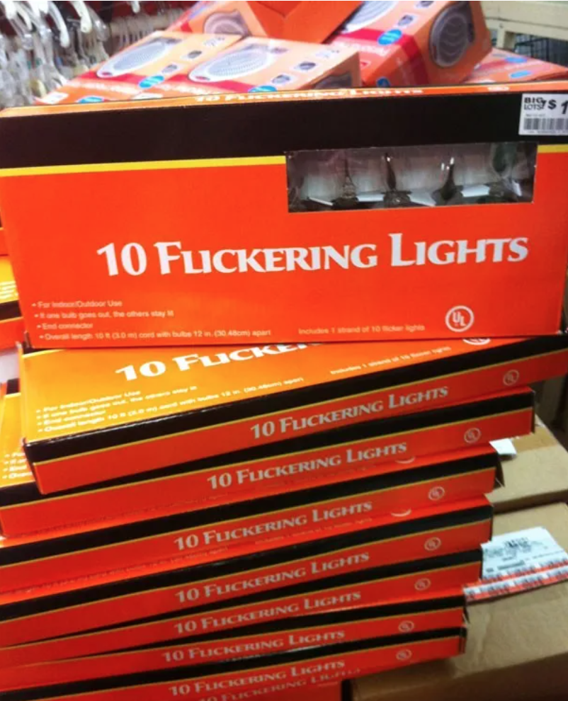
In worst-case scenarios, bad kerning can alter the meaning by adding spaces in the middle of words or bunching letters together where spaces should be — often with hilarious results, like these boxes of “10 Flickering Lights”:
5. Low contrast
Low-contrast typography can strain the eyes and make content difficult to read, affecting user experience and conversions. Because low-contrast text is difficult to read, it disrupts user flow, and since most people skim rather than reading, it negatively impacts user experience.
Additionally, the use of low-contrast text can make your designs inaccessible for those with visual impairments, and can make your brand or project appear low-budget, unreliable, and even a little bit sketchy.
Even though designers know this, low-contrast text is still the most common accessibility issue (for the fifth consecutive year!) in 2023, according to the Bureau of Internet Accessibility.
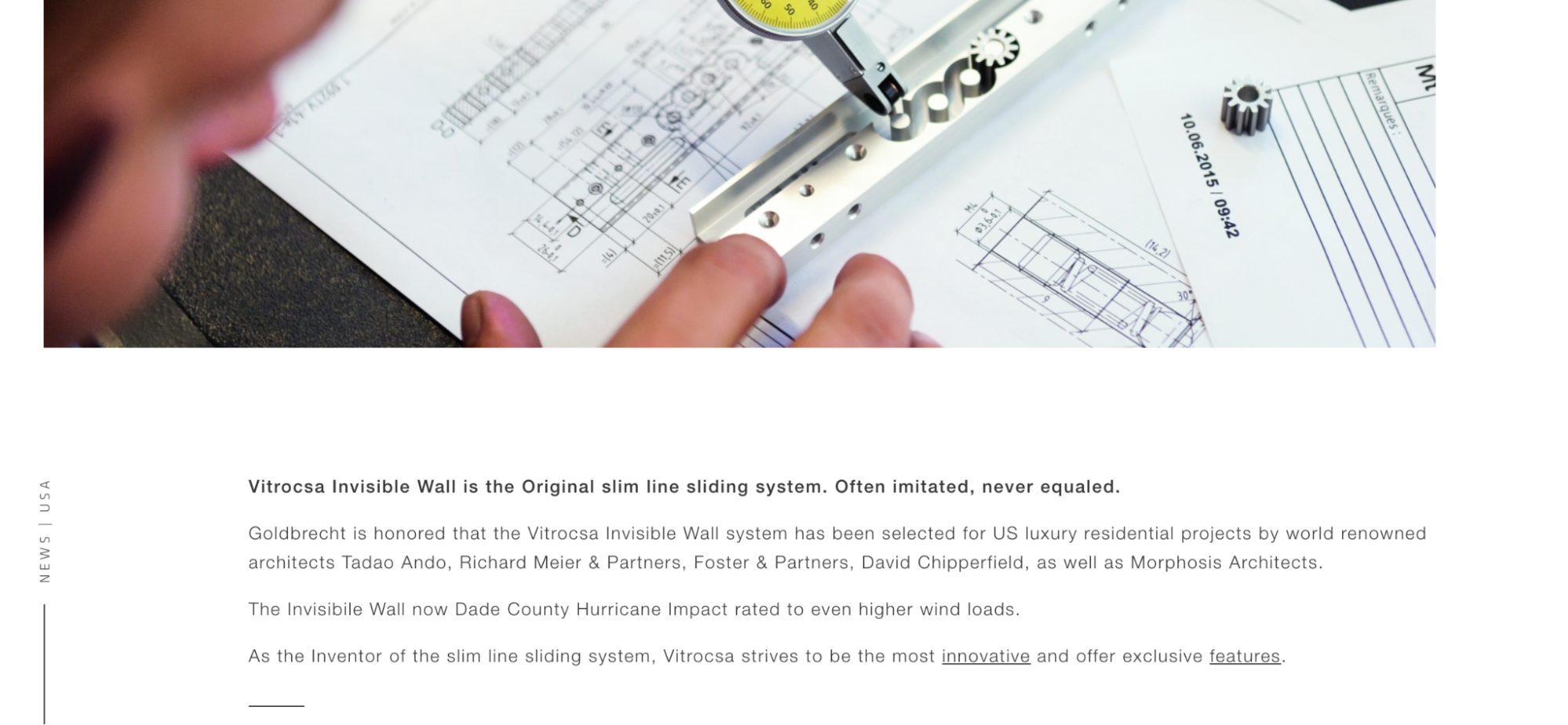
For example, check out the website of Goldbrecht, a window design company. The low-contrast text makes it difficult to read, even for those with no visual impairment:
6. Overcrowding text
Cramming too much content into a small space, using small font sizes, or overwhelming designs with images can make content appear daunting and discourage engagement.
Research shows that overcrowded design requires much greater processing time, slowing down readers and potentially putting them off reading further.
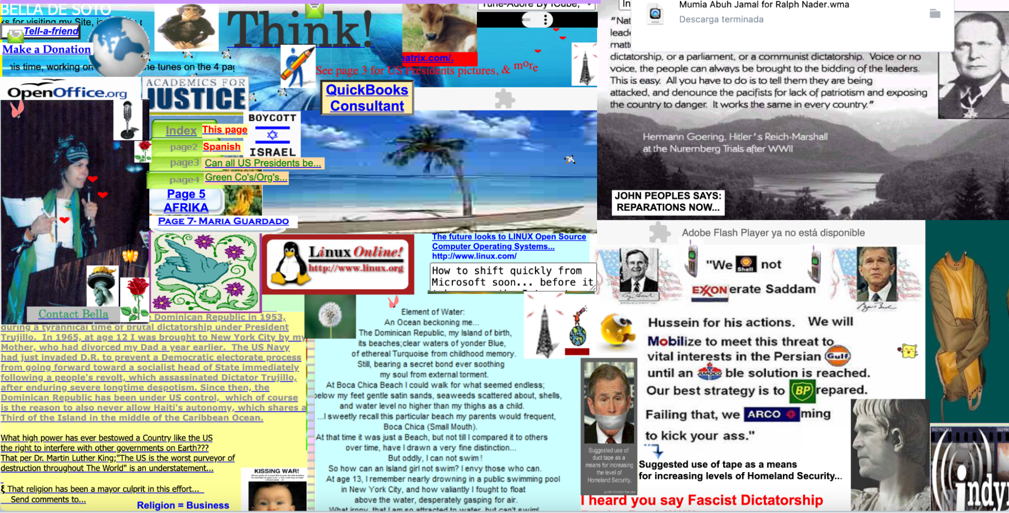
Perhaps it’s a deliberate choice, but Bella de Soto’s website showcases exactly what not to do with your website. Text upon text upon poor-quality animations and an unnavigable design will have users running screaming in the opposite direction.
7. Unbalanced alignment
Misaligned text, such as centered text for long paragraphs, can create distracting gaps and make the content less readable. Similarly, inconsistent line length, which leads to overly long or short lines of text, and vertical rhythm — which influences the flow of the text — can make reading uncomfortable and disrupt the reader’s flow.
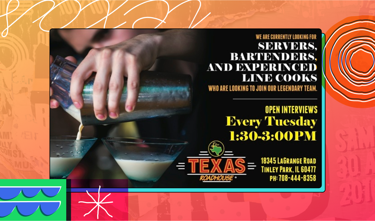
In the example below, the key message (“We are looking for staff”) is confused by the inconsistent spacing and right-alignment. It would be better on the left and in a consistent, readable font.
6 best practices for choosing fonts
Your font choices play a crucial role in how your content is perceived, so it’s worth taking the time to make informed decisions that enhance your overall design and communication goals.
To ensure your typography serves its purpose, it’s essential to follow best practices for font selection, pairing, and usage. The following typography design tips will help you navigate these choices.
1. Consider the purpose of the text
The nature of your content should dictate your font choice. For formal documents, serif fonts like Times New Roman or Georgia are recommended as they convey professionalism and credibility.
On the other hand, for more casual or creative content, sans-serif fonts such as Helvetica may be more appropriate due to their modern and clean appearance. Matching the font style to the content’s purpose ensures that your message is conveyed in the most effective manner.
2. Understand your audience
Knowing your target audience is key in selecting an appropriate font since different demographics may respond to different styles.
For instance, a younger audience might appreciate a more playful or unconventional font, while an older or more professional group might prefer something more traditional and understated.
Always tailor your font choice to the preferences and expectations of your audience to ensure better engagement and comprehension.
3. Prioritize readability
Regardless of the context, your text needs to be easily readable in both large and small sizes. Avoid overly decorative fonts or those with intricate details as they can be difficult to read, especially at smaller sizes. Fonts that are simple and clear should be your go-to choices, as they ensure your message is accessible to the widest possible audience.
4. Limit your font usage
A common mistake in design is using too many different fonts, which can lead to a cluttered and confusing visual experience. As a best practice, limit yourself to two or three fonts per design. This allows you to create a clear hierarchy and contrast in your text, making your content more navigable and aesthetically pleasing.
5. Pair fonts
Like food and fine wine, it’s essential to ensure that your fonts complement each other. Fonts within the same family or those with similar proportions and shapes tend to work well together. Avoid pairing fonts that are too similar, as this can make your design look monotonous. Instead, aim for a balanced contrast that adds visual interest without overwhelming the design.
6. Maintain brand consistency
Your font choices should align with your brand identity. Consistency in typography reinforces your brand image and helps build trust with your audience.
Ensure the fonts you choose resonate with your brand’s personality, whether it’s formal, playful, or somewhere in between. A consistent font style across all your communications strengthens your brand presence and makes your content instantly recognizable.
Master the art of typography to elevate your designs
Typography is more than just choosing a font — it’s a crucial tool for effective communication and design. By avoiding common typography mistakes and adhering to best practices, you can create compelling, readable, and engaging content that enhances user experience and aligns with brand identity.