We sat down with Ronnie, a designer with a focus on branding and illustration. We gravitated to his use of bold colors and patterns throughout his projects.
Tell us about your story and how you got into design?
I grew up in a small town in Texas. I started college as an architect but decided that wasn't really for me. I had no idea what graphic design was but during those first two years I had some friends who were in the design program so I switched over and it was so obvious that it was what I was meant to do with my life.
It's crazy because my whole life I had been doing graphic design but I didn't even realize that's what it was and that I could make a career out of it. I've kind of been jumping from agency life to freelancing and going back and forth between the two.
Your work is amazing, how would you say that you've developed your design style?
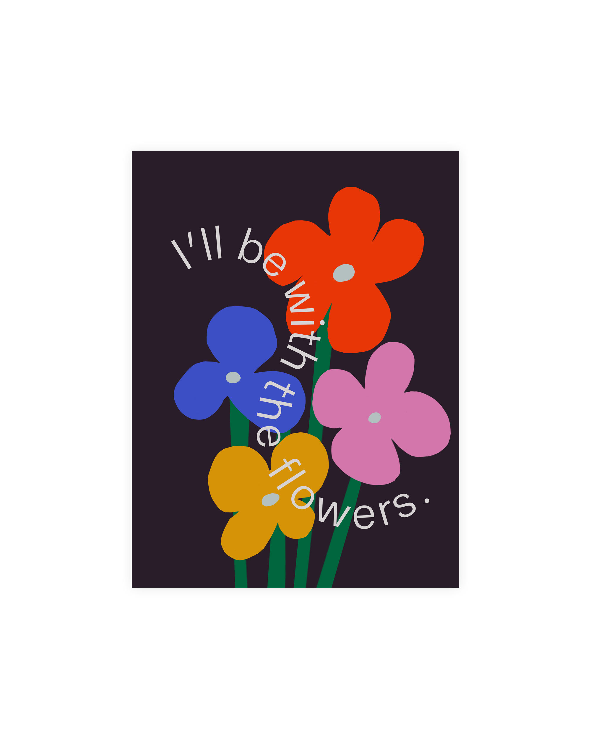
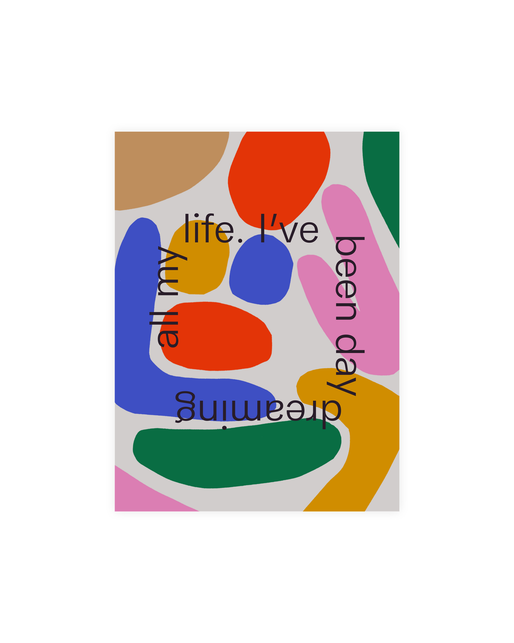
I really love bold expressive patterns and colors and making weirdness out of random things. I like putting together all the things that I can find and just making it very bold and expressive. I kind of just made it a method of self expression. For a while, whenever I would have a random thought, I would put pen to paper and create an illustration that represented that thought to me as a way to keep my creativity flowing. The style just kind of developed on it’s own I guess, it was a way that I could quickly and easily and effectively make something.
How do you select bold colors to use for projects?
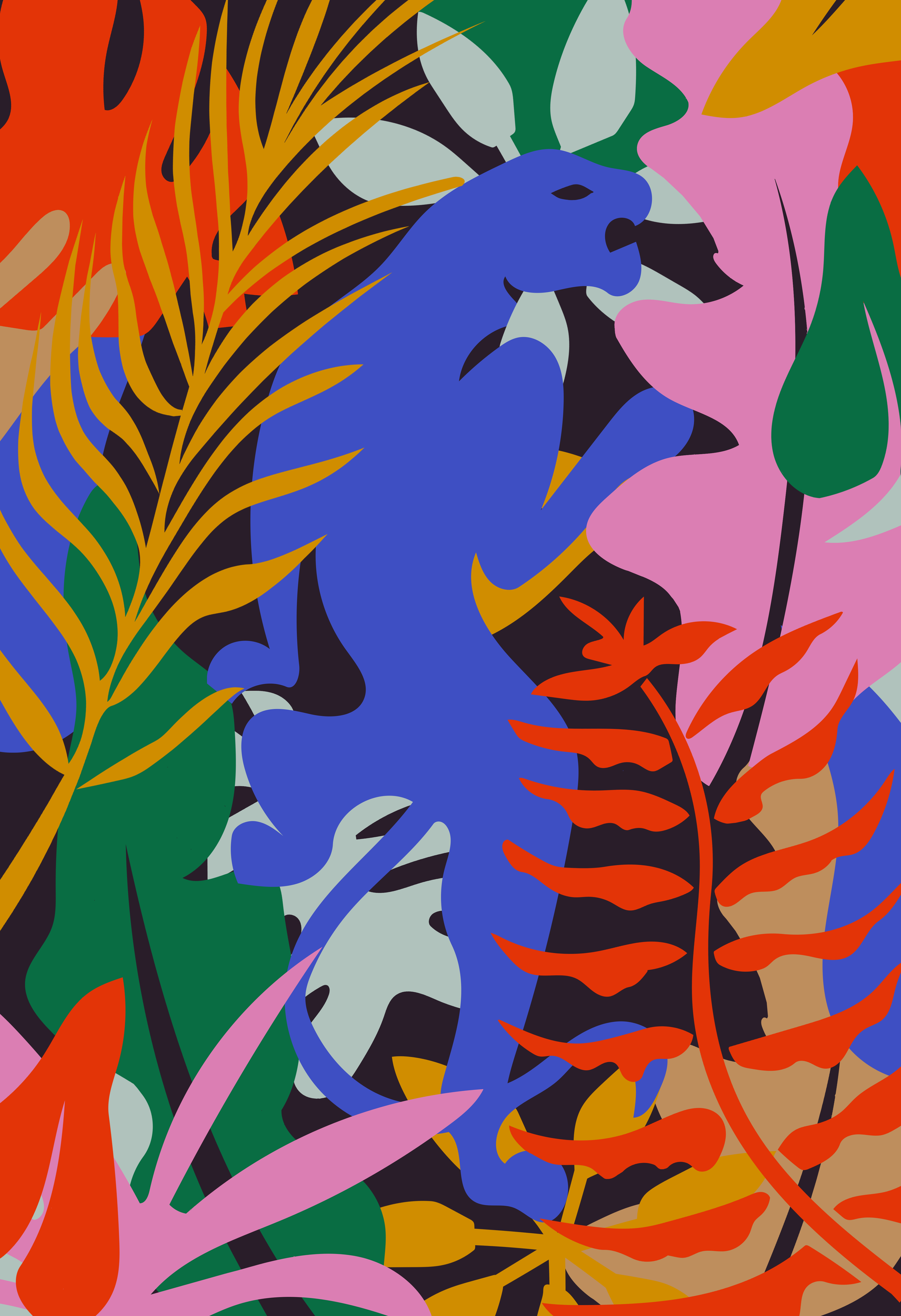
For a while they're trying to keep everything super concise because I'm a major perfectionist. So for a while I was using the same very strict palette of pink, brown, green, red, yellow, and blue, which is almost like the whole rainbow, but very specific shades of all those colors. I really like the cohesion that comes together when they're all so different and I think they meld really well.
How would you describe your work in three words?
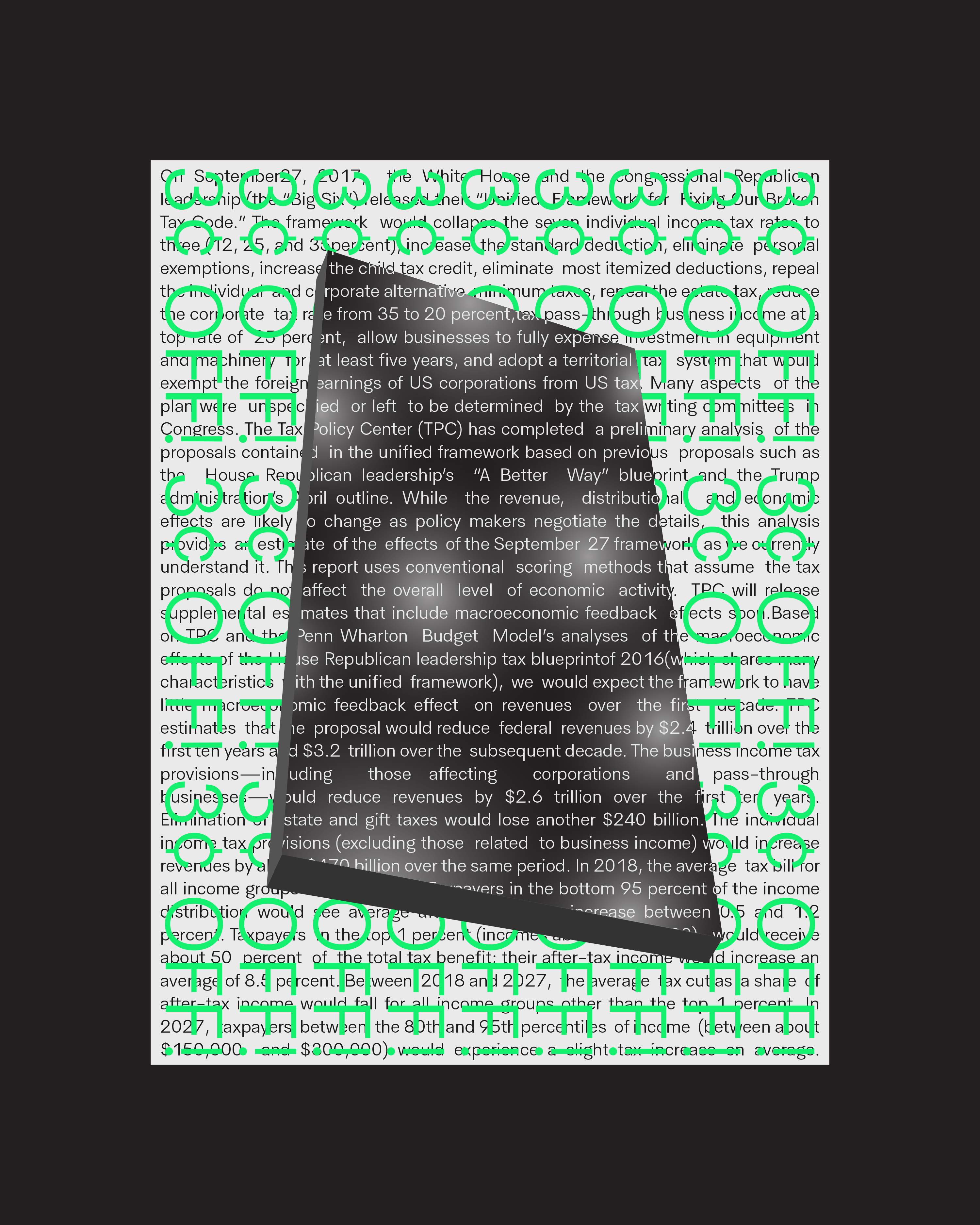
Calculated, expressive and challenging. I was super inspired in school by the Memphis style and the whole design theory behind it. It's a challenge for the viewer where they have to engage with the piece more, longer than just staring at it because it's literally hard to look at, so you have to get in and look at the details and notice all the small things.
Do you have a creative process you follow for each of your projects?
Yeah, I usually use InDesign for projects and try to really lay everything out. Everything needs to have a reason, I don't just do something because it looks cool or it feels right, it's all very calculated. I’ll choose a typeface and a color based on the feeling that it gives you not necessarily because it's the coolest typeface that's out right now.
Do you have a preference between working as a freelancer or in an agency setting or do you like the balance of both?
I like the balance of both but there's positives and negatives to both of them. I love the freedom freelance gives me, and I don't have to really listen to anyone's opinion if I don't agree with it. Within agency life, there's bigger problems I have to solve, opposed to small logo projects, etc. It's just two different modes of thinking.
Do you have a favorite project you've worked on?
I recently rebranded a construction company, which at first didn't seem like it would be the most exciting but they let us have a lot of creative freedom with it. They wanted to be very bold and expressive so we got to really play around, which was a lot of fun. It was also one of the first projects where I got to lead a team, so that was also exciting.
. . .
Ronnie is based in Philadelphia, Pennsylvania and is available for freelance work and collaborations. Check out more of his work on his site or follow along on Instagram.
