Typography is everywhere — in fact, it’s so ubiquitous we hardly even notice it.
Yet every single thing you read — from the ingredients on your cereal packet to the posters on public transport — was carefully selected by a typography designer.
Typography is essential for communicating a brand’s identity and character and can make the difference between a good first impression and an underwhelming one. It adds a tone of voice, subliminally reinforcing the message of the words to influence how they’re perceived.
Typography is an in-demand skill in graphic design and is fundamental in everything from logo design to web design. Graphic designers should master typography design so they can create stand-out brand identities for their clients.
This article will cover the basics of typography design, a glossary of typography terms, and some typography rules — along with a few examples to get you inspired.
What is typography design?
Typographic design is the process of designing text to convey the appropriate intent and tone of written messages — a key but underrated aspect of graphic design.
Good typography should go unnoticed. If the typography is done well, you’ll simply read the text and gather the information you need. But if the typography is hard to read, chances are you’ll bounce off the page.
It’s important to understand the difference between type design and typography design. A type designer is someone who creates typefaces, fonts, and letter forms.
A typographer — or typography designer — works with typefaces as part of their graphic design work to create something unique and memorable. They do this by arranging and stylizing all the text in a design project across a variety of platforms — whether it’s a website, blog, poster, advert, or app.
Type design has been around for centuries. Before writing implements and paper, people carved written messages onto stone and wood. And before Johannes Gutenberg revolutionized typography with the printing press, scribes would painstakingly create consistent typefaces by hand.
Even today, this ongoing interaction between the natural and the artificial — the organic and the geometric — echoes throughout modern typography design.
A glossary of typography design terms you need to know
To get started with typography design, you’ll first need to familiarise yourself with some key terminology and how each concept applies to typography design.
Typefaces vs. fonts
Often used interchangeably, there is a fundamental difference between a typeface and a font.
A typeface — also known as a font family — is the visual design applied to a set of numbers and letters that gives it a specific look and feel. Examples of popular typefaces include Arial, Helvetica, and Times New Roman.
Cyrus Highsmith, author of Inside Paragraphs, says typefaces represent the voice of an atmosphere or historical setting.
A font is a particular version of a typeface with variations of weight, size, and stylization — such as bold or italicized. So an example of a font could be Helvetica Bold 16 point.
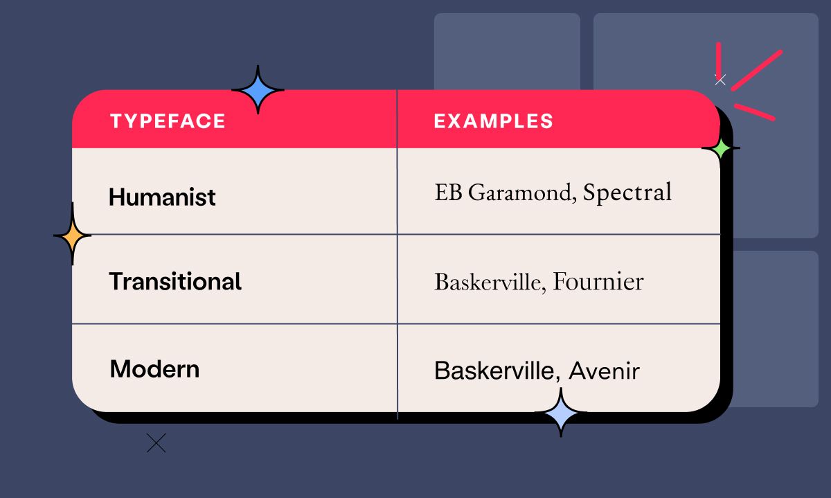
There are three main types of typefaces: humanist, transitional and modern.
Humanist typefaces were designed to look like traditional calligraphy, and their letters are rounded and include forms that imitate pen strokes. Examples of humanist typefaces include EB Garamond and Spectral.
During the 18th century, transitional typefaces emerged. These introduced greater contrast between the thick and thin strokes and added wider serifs with graceful brackets and flat bases. Examples of transitional typefaces include Baskerville and Fournier.
At the beginning of the 19th century, modern typefaces emerged. These are characterized by their weight contrasts and thin, sharp serifs. Examples of modern typefaces include Helvetica and Avenir.
Serif and Sans Serif
Many typefaces include both serif and sans serif fonts. But what do these words mean?
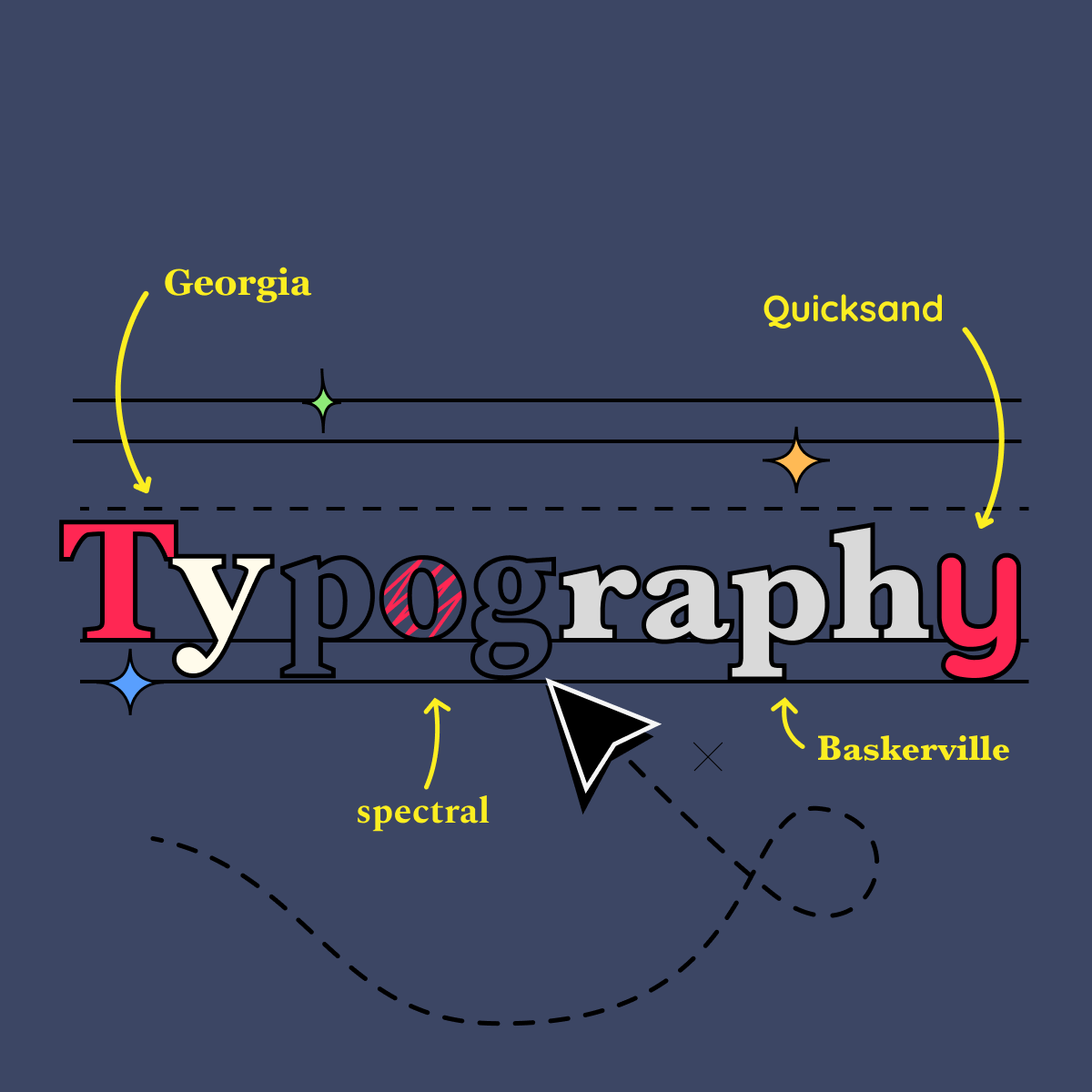
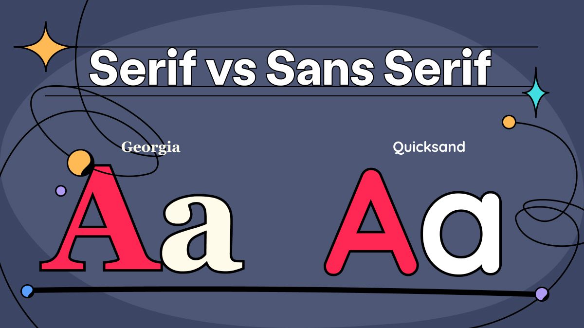
A serif is a small, decorative protrusion from the main stroke of the letter. Serif fonts include Georgia and Playfair Display.
“Sans” is a French word that means “without” — so sans serif typefaces are those that lack serifs. Examples include Montserrat and Quicksand.
Tracking
Tracking is the process of adjusting the white space between letters, which is why it’s also known as letter spacing. In general, smaller fonts should have larger tracking to create space between the characters and improve legibility.
As fonts get larger, the tracking should decrease to avoid creating large gaps between letters. As a rule of thumb, uppercase letters require more generous tracking than lowercase.
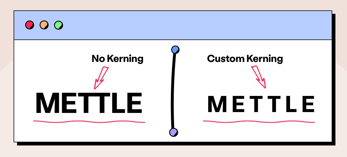
Kerning
Kerning is similar to tracking but is the process of manually fine-tuning the space between individual letters to improve readability.
Most fonts come with their kerning built-in for every combination of two characters, but you may still need to adjust the kerning in some cases.
For instance, bad kerning may not be immediately noticeable within a body of text, but it can instantly ruin a logo or headline.
Leading
Leading refers to the vertical space between two lines of text. Leading can be measured in various ways, from pixels or points to terms such as single-spaced or double-spaced.
Just like tracking, the right amount of line spacing helps readers navigate the text, while too much or too little is confusing and difficult to read.
Hierarchy
Hierarchy in typography refers to the differences in size and weight between pieces of text of differing importance. Headings, for example, are higher in hierarchy than the body text.
Hierarchy offers significant room to play around with — designers can experiment with different sizes of the font as well as with other fonts in the same typeface, or sometimes, a font from an entirely different typeface for the heading.
Alignment
Alignment refers to the axis against which the text rests. Flush left alignment aligns the text to the left margin, while flush right aligns it with the right margin.
Flush left is the most commonly used in English and other languages that use the Roman alphabet. When using this alignment, it’s important to balance the row lengths to avoid having one row sticking out further than the others or leaving a single-word line (these are called widows).
Flush right creates a more unusual look, which can be great for drawing attention but can be harder to read in long paragraphs.
Centered text is arranged around an axis in the middle of the page. While it can look boring, the key is to play with tracking and kerning to make the text look balanced.
Justified alignment spaces out the text evenly from left to right. It can look great when done well, but again it may be necessary to play with tracking and kerning to avoid any awkwardly large spaces.
Top 4 rules in typography design
Now that we’re over the terms, let’s take a look at a few key guidelines that will help any typography designer create amazing designs, no matter their experience level.
Default to standard fonts for beginners
In the early days of your design career, it’s best to err on the side of caution when designing typography. Go for safe and reliable over experimental and risky — at least with your first few designs.
Standard, web-safe fonts may not look as quirky or visually arresting, but they’re easy to read, familiar for most readers, and recognized by most web browsers and phone apps.
By contrast, if you pick an out-there non-standard font, the web browser may not render your font and default to something less-than-desirable.
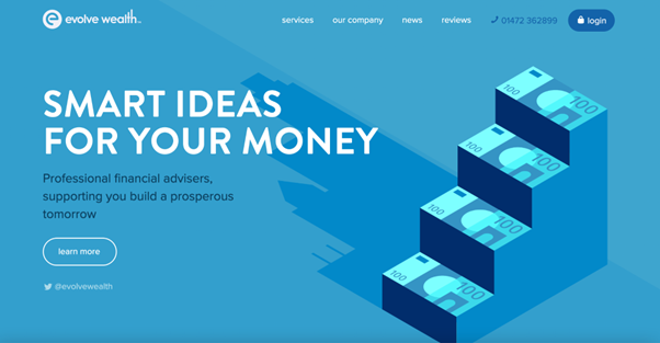
Take a look at this example from Evolve Wealth that shows how to create a professional-looking website using a standard typeface:
Limit the number of fonts in use
When designing something like a website homepage, never use more than two or three fonts.
Creativity needs some limits to truly thrive, and a website with a few carefully chosen fonts looks more appealing than one with multiple typefaces that confuse the eye.
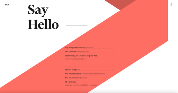
For example, this minimalist design from Rally Interactive uses just one typeface — Chronicle Display — for both the headline and form text:
Use a sans serif font for body text
In general, this is a rule that most typographers seem to agree with. While serif fonts are better for headers, subheadings, decorative text, and pull quotes, the human brain generally comprehends sans serif better on a webpage.
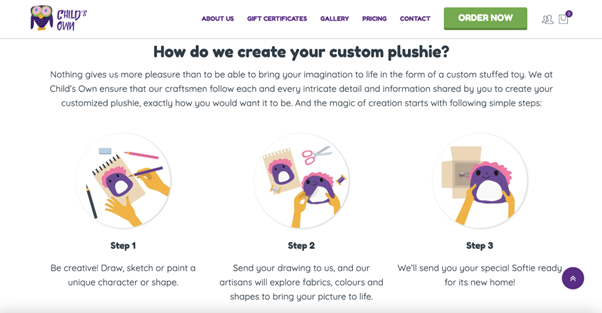
A great example is the Child’s Own website. The sans serif font is easy to read — and they’ve done a good job with the tracking and kerning, too.
Be careful with colored text and backgrounds
This is something a lot of typography designers are cautious about. Using text against a non-white solid-color background is tricky enough, let alone something more complex like a gradient or image.
The text should maintain the right level of contrast against the background to be legible at all times. The Web Content Accessibility Guidelines recommend at least 4.5:1 for most text and 3:1 for bold text.
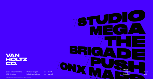
If you’re going to take the plunge and use a colored background, take a leaf out of Van Holtz’s book. This design studio uses huge, animated typography to make the text stand out. The letters move and lose their fill, becoming outlined as you hover the mouse over them.
Win more clients with typography design
Graphic designers who know how to work with typography are in high demand among brands that want to stand out from the crowd and convey a particular message to their customers.
Whether you’re just starting out or are an experienced designer, honing your typography design skills will add another string to your bow and have clients knocking on your door.
For more design resources, check out the Playbook Community. It’s full of artists and designers just like you — plus, you can check out our excellent design templates to get some inspiration for your portfolio.