
The right font can make or break your design portfolio. Fonts don’t just affect readability — they shape the tone, personality, and professionalism of your work. Choosing the best font for your design portfolio helps you communicate creativity, credibility, and style at a glance.
Before diving into our top picks, let’s quickly cover the five basic typeface categories you’ll encounter when building a portfolio:
- Serif — Traditional fonts defined by small “feet” at the ends of letters. Great for a classic, trustworthy feel.
- Sans Serif — Clean, modern, and highly readable on screens. A favorite for digital portfolios.
- Script — Calligraphy-inspired, handwritten-style fonts that add flair and personality.
- Monospaced — Fixed-width, typewriter-style fonts that feel structured and technical.
- Display — Bold, decorative fonts designed to grab attention in large headers.
Serif vs Sans Serif: Choosing the Right Style for Your Portfolio
Serif fonts tend to feel polished and sophisticated — a good choice for project write-ups, case studies, or brand identities rooted in tradition. Sans serif fonts, on the other hand, are approachable, versatile, and well-suited for screens, making them ideal for modern portfolios.
Most portfolios benefit from mixing typefaces: using a sans serif for headers and a serif for longer text blocks creates a balanced visual hierarchy. And yes, every designer has their favorite. Are you Team Serif or Team Sans Serif? Whichever you choose, try it out on your own free Playbook portfolio template.
The Top Fonts Designers Use in Their Portfolios
Below are some of the most popular fonts among designers, complete with examples and tips for using them in your portfolio.
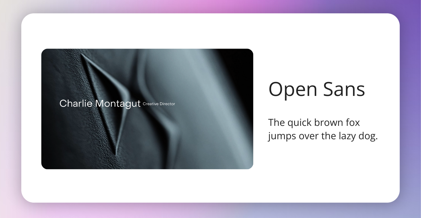
1. Open Sans
Created by Steve Matteson, Open Sans is a clean, neutral font that works beautifully across web and print. Its versatility makes it one of the most popular choices for portfolios — you’ll see it used in everything from headers to body copy.
👉 Example: Charlie Montagut’s portfolio.
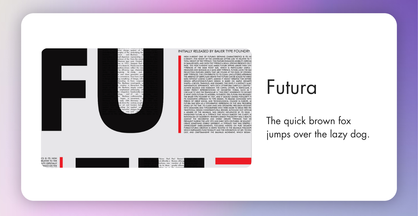
2. Futura
Designed in 1927 by Paul Renner, Futura is geometric, modern, and timeless. Its simple shapes give your portfolio a forward-thinking feel without overwhelming the work itself.
👉 Example: Nino Tsutskiridze’s Behance project.
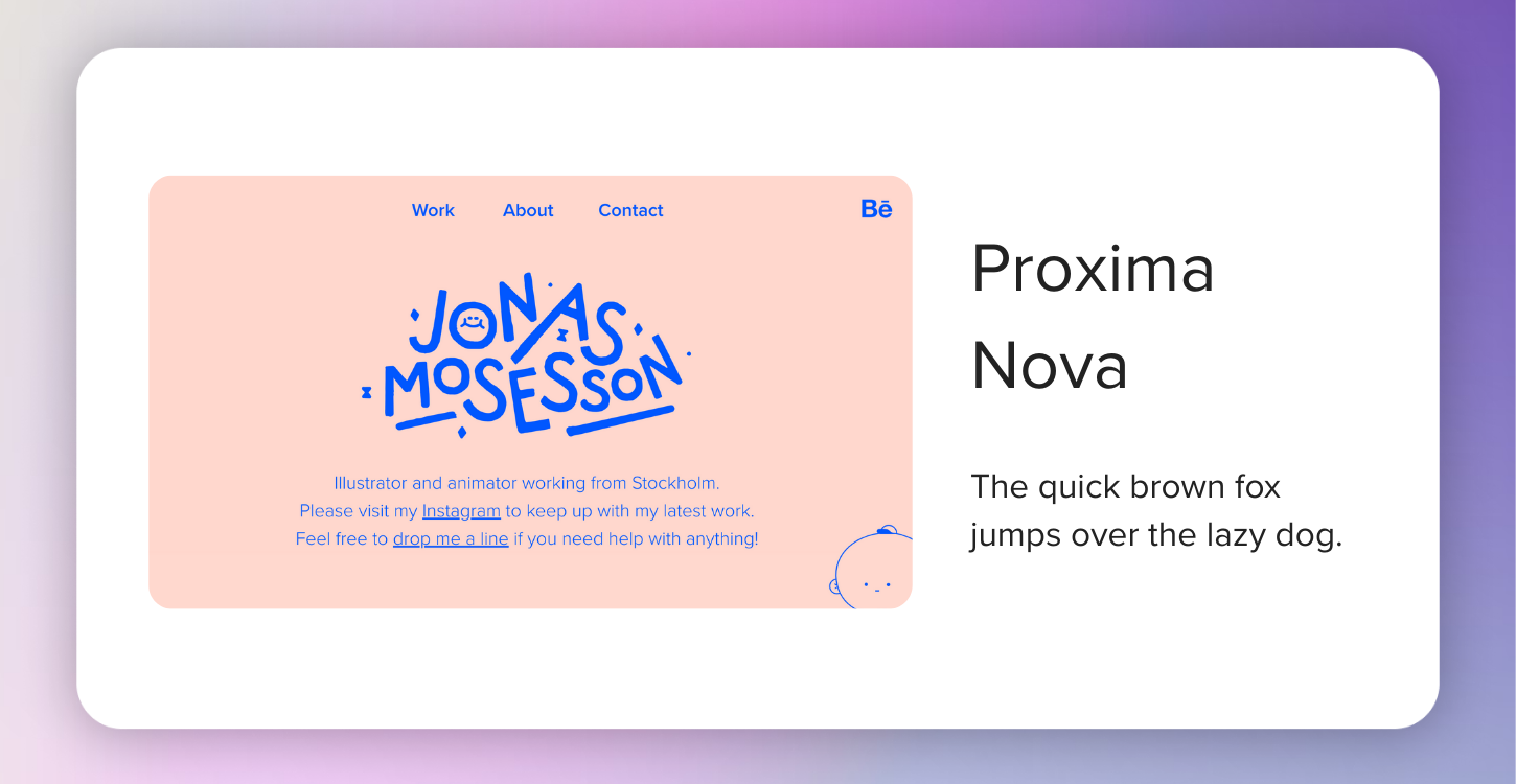
3. Proxima Nova
Known as the “workhorse” of modern design, Proxima Nova bridges the gap between Futura and classic grotesques. It’s approachable but sharp, pairing well with serif fonts like Georgia or Playfair Display.
👉 Example: Jonas Mosesson's portfolio.
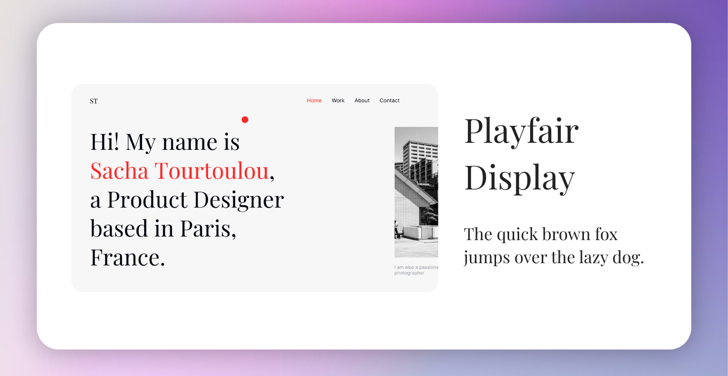
4. Playfair Display
A serif font influenced by 18th-century typefaces, Playfair Display adds instant sophistication to a portfolio. Perfect for titles, headers, or project intros where you want to make a statement.
👉 Example: Sacha Tourtoulou’s portfolio.
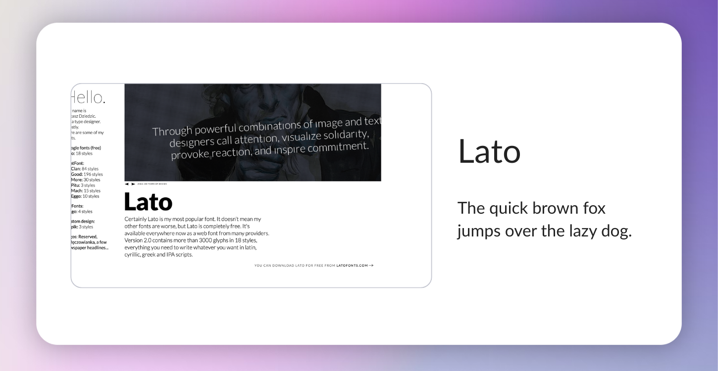
5. Lato
Warm, approachable, and extremely versatile, Lato is a designer favorite. Created by Łukasz Dziedzic in 2010, it works across weights and sizes, making it a safe bet for body text.
👉 Example: Łukasz Dziedzic’s portfolio.
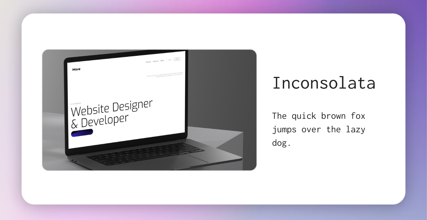
6. Inconsolata
This monospaced font brings structure and quirk to a portfolio. Originally created for code listings, Inconsolata has since become popular among designers for its eccentric but clean aesthetic.
👉 Example: Mave Studio.
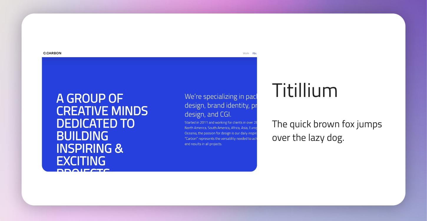
7. Titillium
Developed as an academic project in Italy, Titillium is dynamic and flexible. It’s elegant at lighter weights but bold and confident when heavy, making it a versatile option for both headers and body text.
👉 Example: C.Carbon Studio
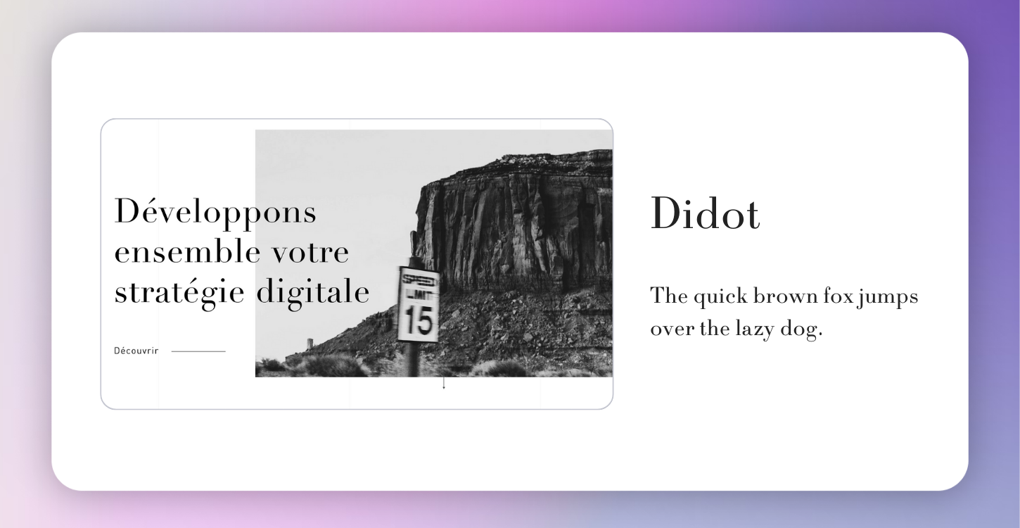
8. Didot
Didot communicates luxury and refinement, often used in fashion and editorial design. If your portfolio leans toward high-end or aspirational work, Didot can instantly elevate the overall aesthetic.
👉 Example: Everess Studio.
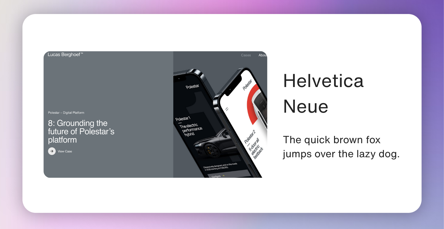
9. Helvetica Neue
An update of the iconic Helvetica, Helvetica Neue refines proportions and spacing for improved readability. It’s widely loved for its neutrality and adaptability — perfect when you want the design, not the font, to shine.
👉 Example: Lucas Berghoef’s portfolio.
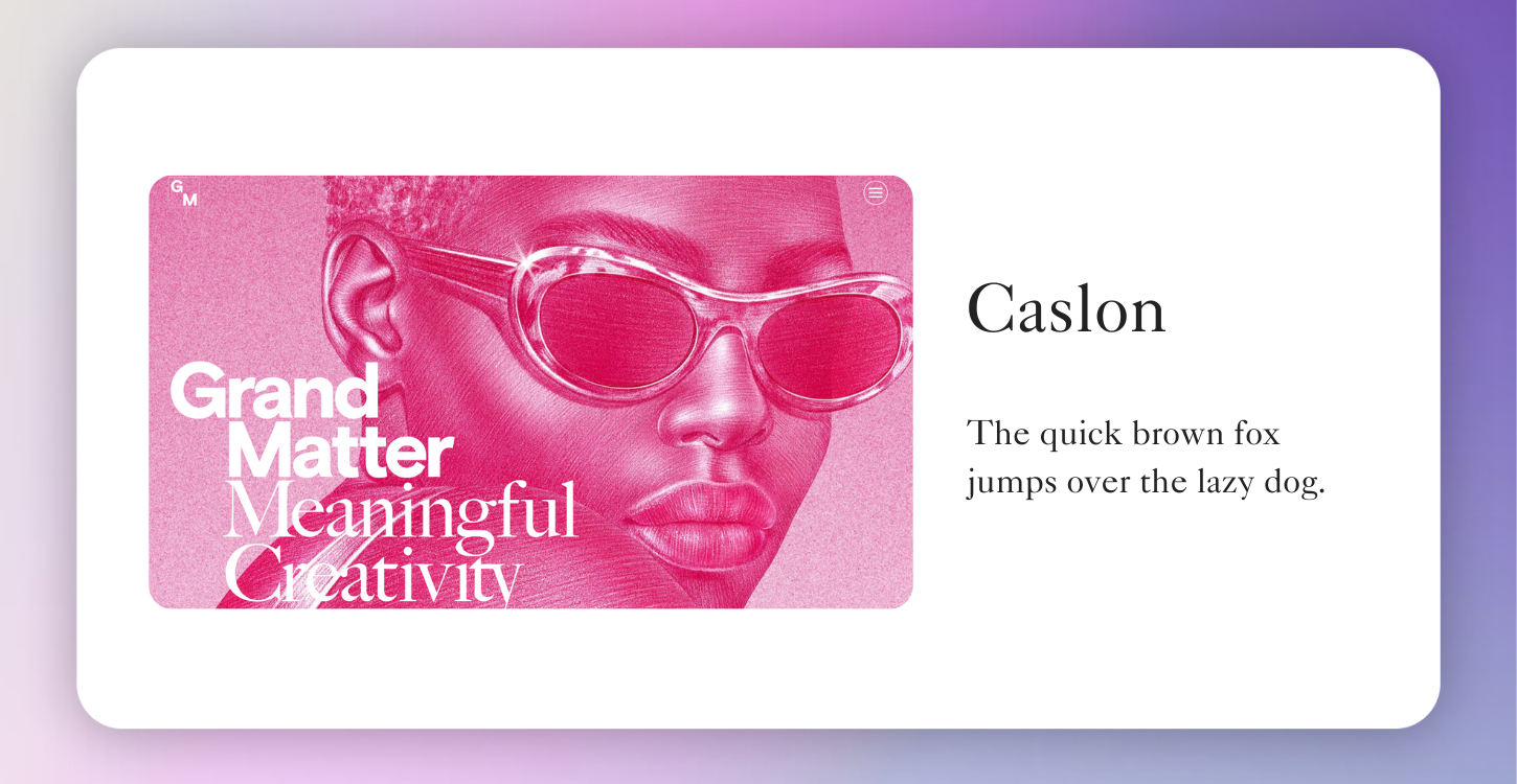
10. Caslon
A timeless serif designed by William Caslon in the 18th century, Caslon remains popular in both digital and print. It communicates reliability and tradition while staying warm and approachable.
👉 Example: Grand Matter.
How to Choose the Right Font for Your Portfolio
This list is just a starting point — the best font for your portfolio depends on your style, your audience, and the kind of work you want to highlight. Picking the “best” font also depends on your goals and audience:
- Show authority and professionalism? Choose a serif (Caslon, Playfair Display).
- Show innovation and creativity? Lean into sans serifs (Open Sans, Proxima Nova, Futura).
- Want personality or a techy edge? Try scripts or monospaced fonts (Inconsolata).
Most importantly, keep consistency. Fonts should enhance your portfolio, not distract from your work.
Create Your Design Portfolio with Playbook
Fonts are only one part of your design portfolio — the biggest challenge is presenting your work in a way that feels cohesive, professional, and easy to share.
That’s where Playbook comes in. Designers use Playbook not just for storage, but as a visual portfolio platform where your fonts, images, and projects stay beautifully organized. Whether you’re sharing a polished portfolio with clients or storing works-in-progress for personal reference, Playbook makes it simple.
- Showcase your portfolio with beautiful, free templates.
- Store files in a visually organized creative library.
- Share your work easily with clients or employers through simple links.
Whether you’re building your first portfolio or refreshing an old one, Playbook helps you present your work in the best light — fonts and all.
✨ Ready to try it yourself? Start building your free Playbook portfolio here.